Making Fasciae for My Paradise
As I mentioned in my last post, I had all kinds of complicated ideas for my Paradise fasciae, with all manner of rear illumination, parallax effects, and light pipes being mooted. In the end, I decided on a Chrome Bumper looked, which was comparatively simple.
Which is not to say that it was easy to do.
Getting the Chrome Bumper Look
So how did Naim do their Chrome Bumper fasciae? Two ways, both of which are represented in my system.
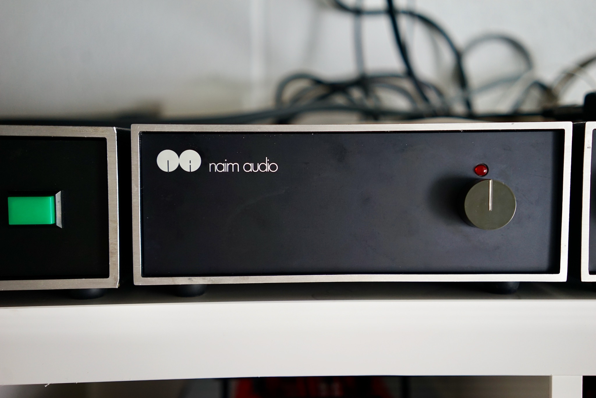
My Snaps and 32.5 have black-painted aluminum fasciae with white logos screen printed.
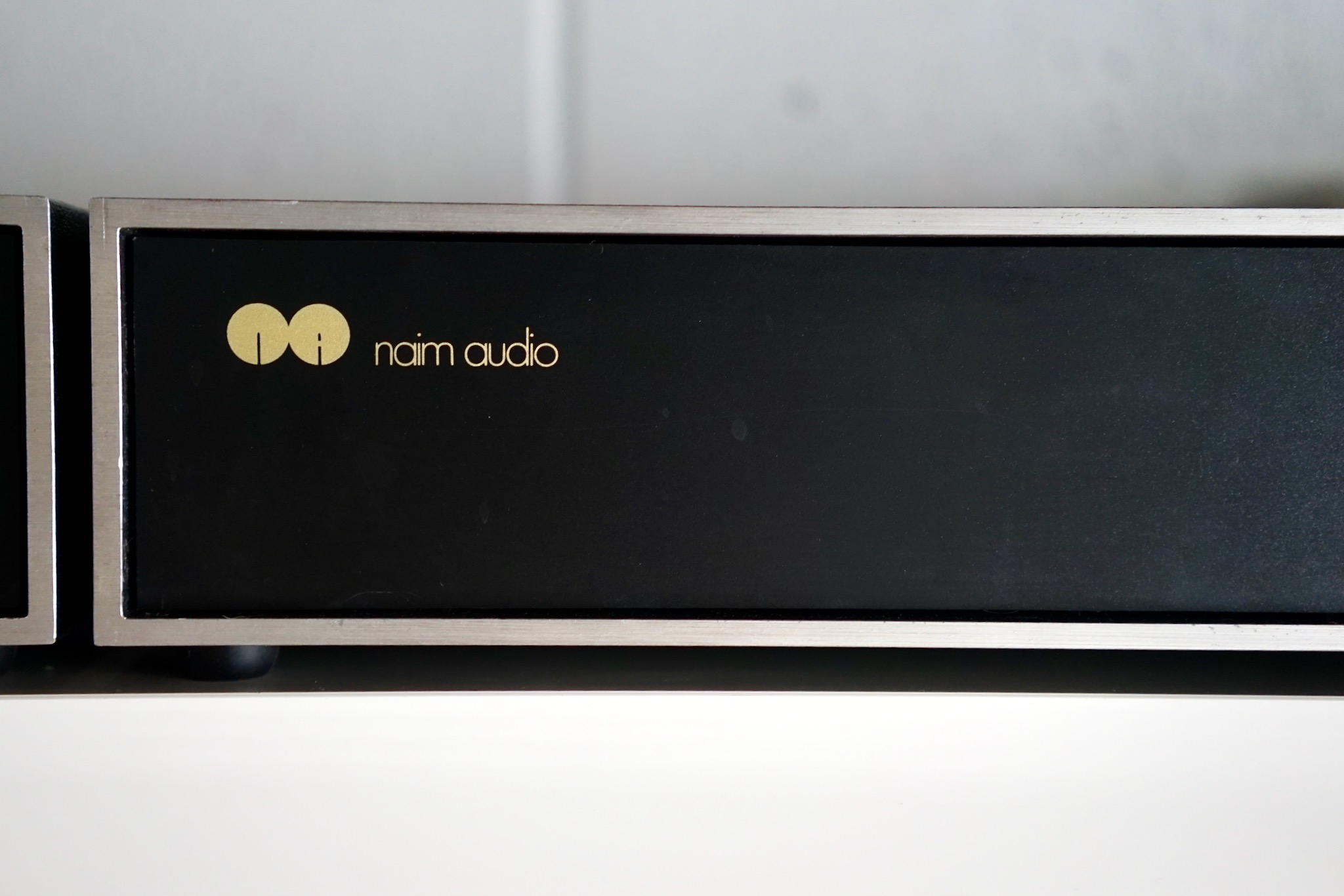
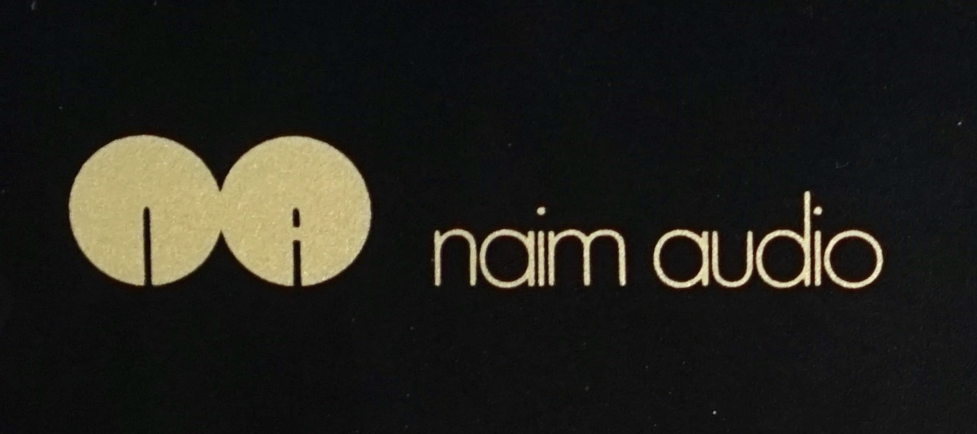
My 135s have polypropylene fasciae, also with screen printed logos. You can see the polypropylene’s speckled texture on the right of the shot. Apparently these logos were originally white and faded to yellow — but the ink looks an awful lot like metallic gold to me. In any case, I like it.
Here is a close-up look at the screen printing on the 135 logos. It’s extremely sharp, but you can see just a little bit of “pixellation” from the silkscreen mesh.
Sourcing materials
I seriously considered getting someone to make these logos for me. I’d taken a one-day silk screening class about ten years ago (I made some very cute t-shirts) but my memory of the process was foggy. Also, I knew I didn’t have the required light tables or a lot of the other tools and inks. So I contacted a bunch of local shops, none of whom seem at all interested in doing the work for me. They either said it would be too complicated, or the logos (0.9cm x 4cm) were too small, or the run of four logos was too small, or they didn’t work with plastic, or they didn’t do silk screening at all. Or they just didn’t respond to my calls or emails. I considered trying to make sticker stencils and using spray paint, but again I couldn’t find anyone who would take on the work.
So I decided to try the screen printing myself. A website called ezscreenprint.com sells kits that you can expose using sunlight rather than using special screen printing lamps (hmm, maybe any screen printing emulations can be exposed using sunlight and I was just taken in by their marketing hype?) The kits were cheap, and came in “high definition” models that seemed like they’d handle my tiny fonts better. So I ordered one of the 5 x 7 kits.
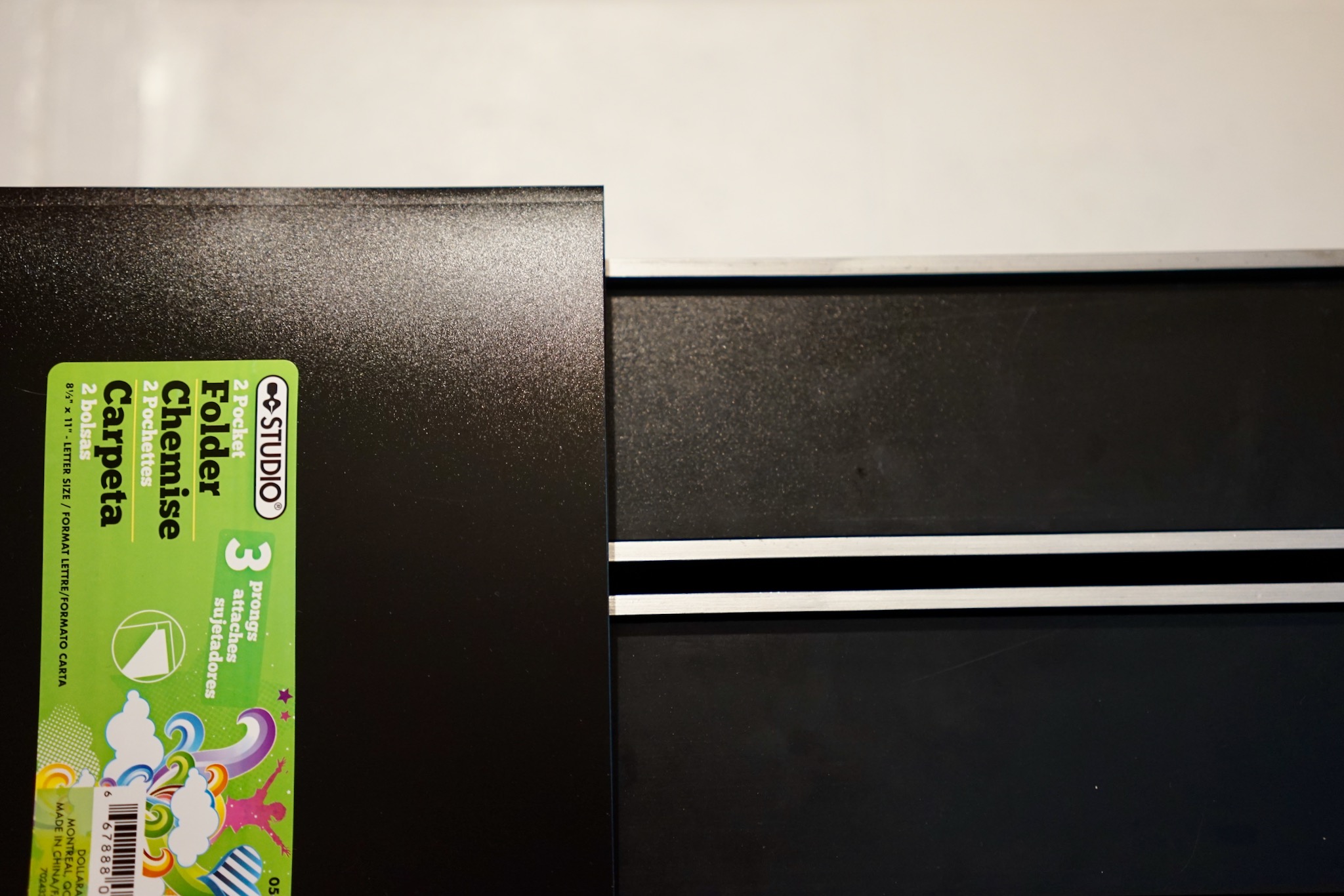
As for the aluminum vs polypropylene decision, I like the speckled look of polypropylene better, and it turned out to be very cheap and easy to source. My local dollar store, Dollarama, sells $1.25 report covers that are made out of precisely the right material. You could make about 8 shoebox fascia from one report cover. I bought two just to be safe.
Making the Screen
I was all ready and excited to spend the Civic Holiday long weekend working on my Paradise. Then my Mouser order didn’t show up on Friday. Every time I’ve ever ordered from Mouser, it arrives via UPS the next day. This time, of course, Mouser forgot to include a necessary commercial invoice and UPS couldn’t deliver. So I won’t be able to really dig into my build until next week. Very annoying.
Anyway, I thought I would do the fasciae, believing this would be a relatively simple job. It wasn’t: it took literally all day. But mostly because I had a lot to learn as I went.
Making the screen itself was relatively straightforward, though.
First, I made a PDF of my logo file (I made the logo itself in InDesign) and took it to my local print shop to have it printed on a transparency. This cost 30 cents.
Next I followed the very clear instructions in the EZ Screen Print kit and exposed the screen printing emulsion to some very bright Toronto sun for exactly one minute. There it is exactly perpendicular to the morning sun…
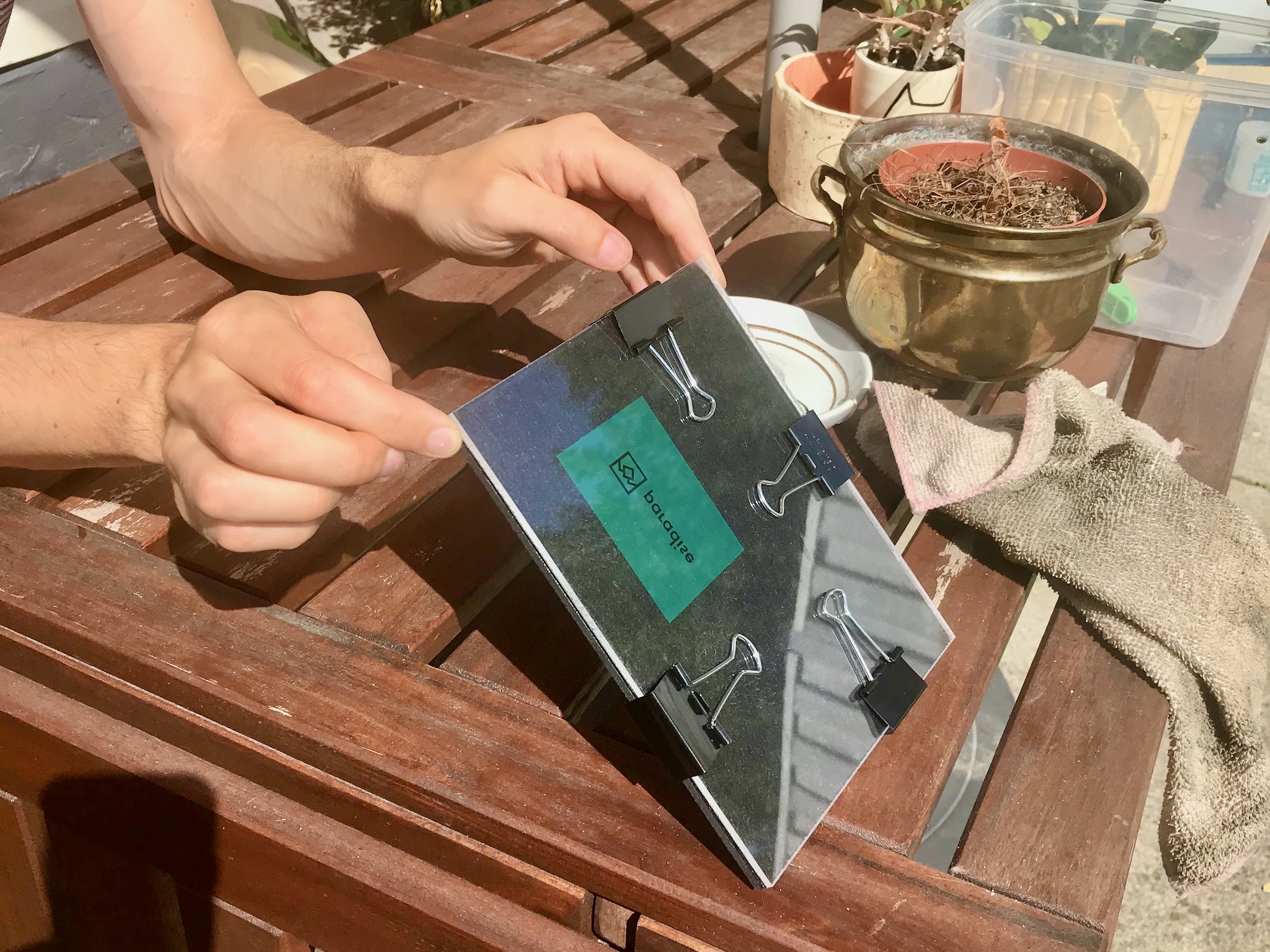
My kit came with two “tester emulsions,” designed to let you get the hang of the exposing process. Luckily for me, my logo fit onto the tester, and I got it right the first time. So I still have all my full-size 5 x 7 screens to work with, as well as another small tester.
Here is my screen taking its 30 minute bath (in the dish I use for making granola, in a low-light spot).
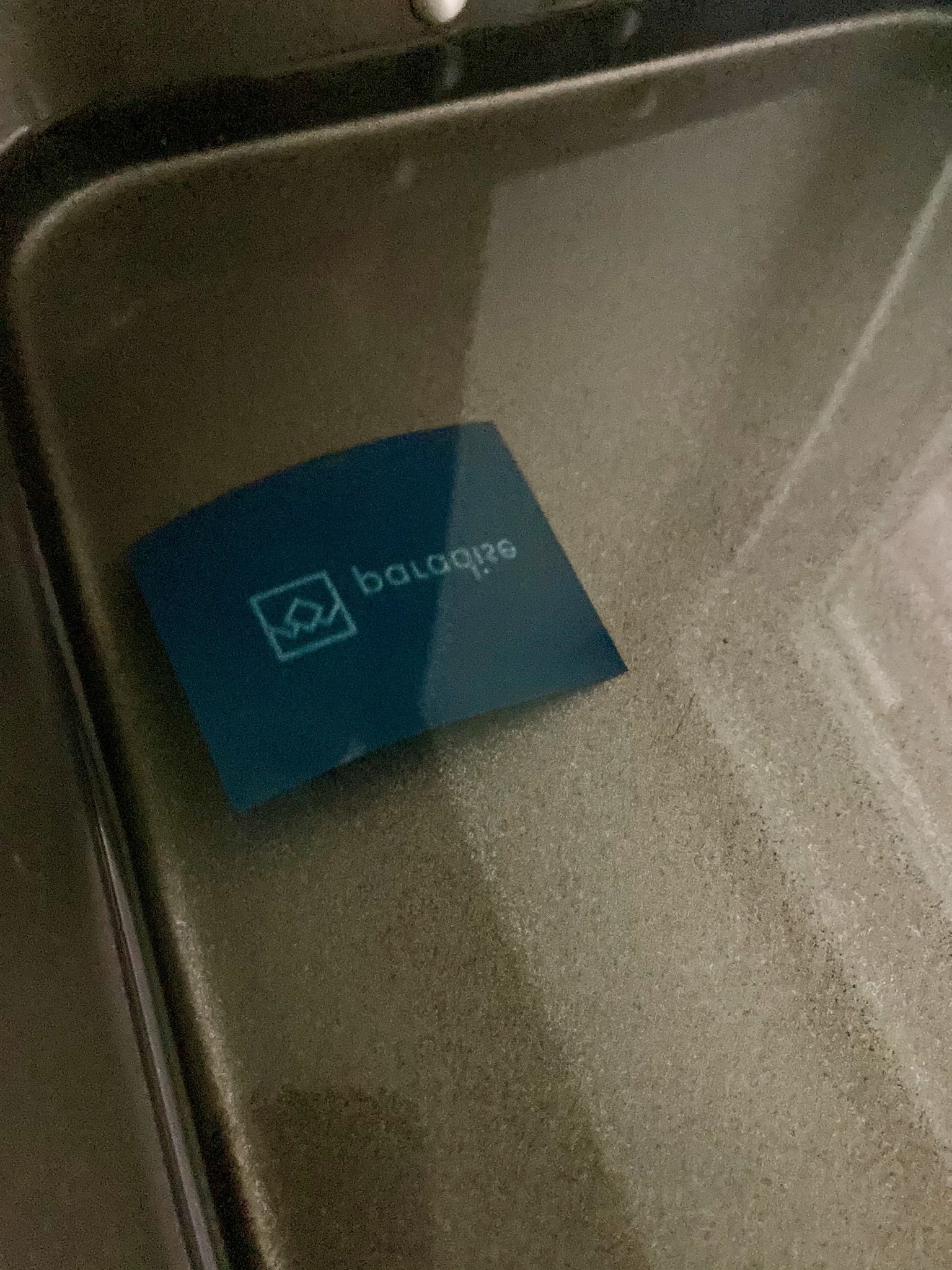
After it emerged from the bath, I rinsed the screen in my kitchen sink and used a paint brush (also from Dollarama) to clear out any gunk. It came out looking excellent.
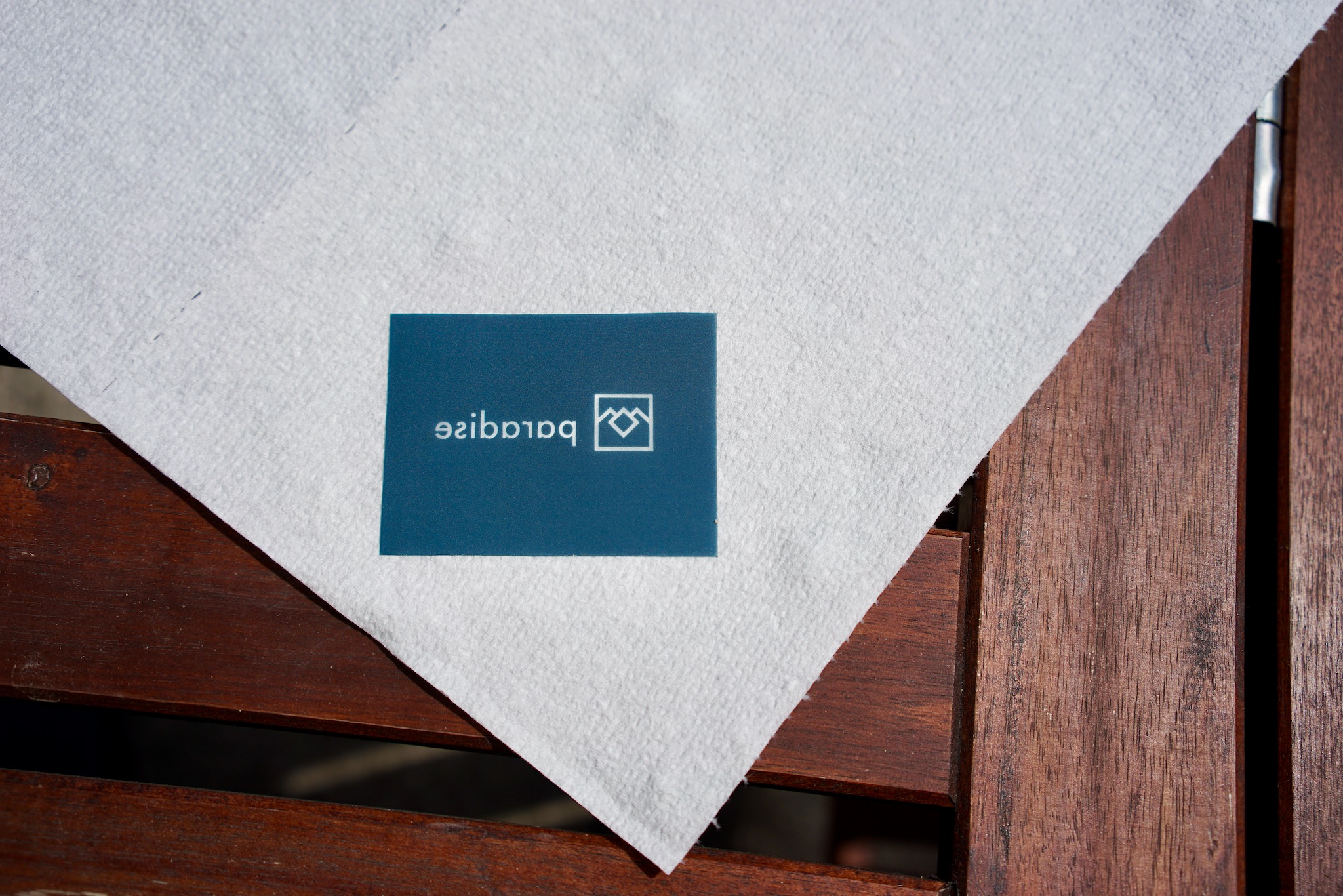
Here is the requisite pun, visual this time, suggesting the link with the heavens…
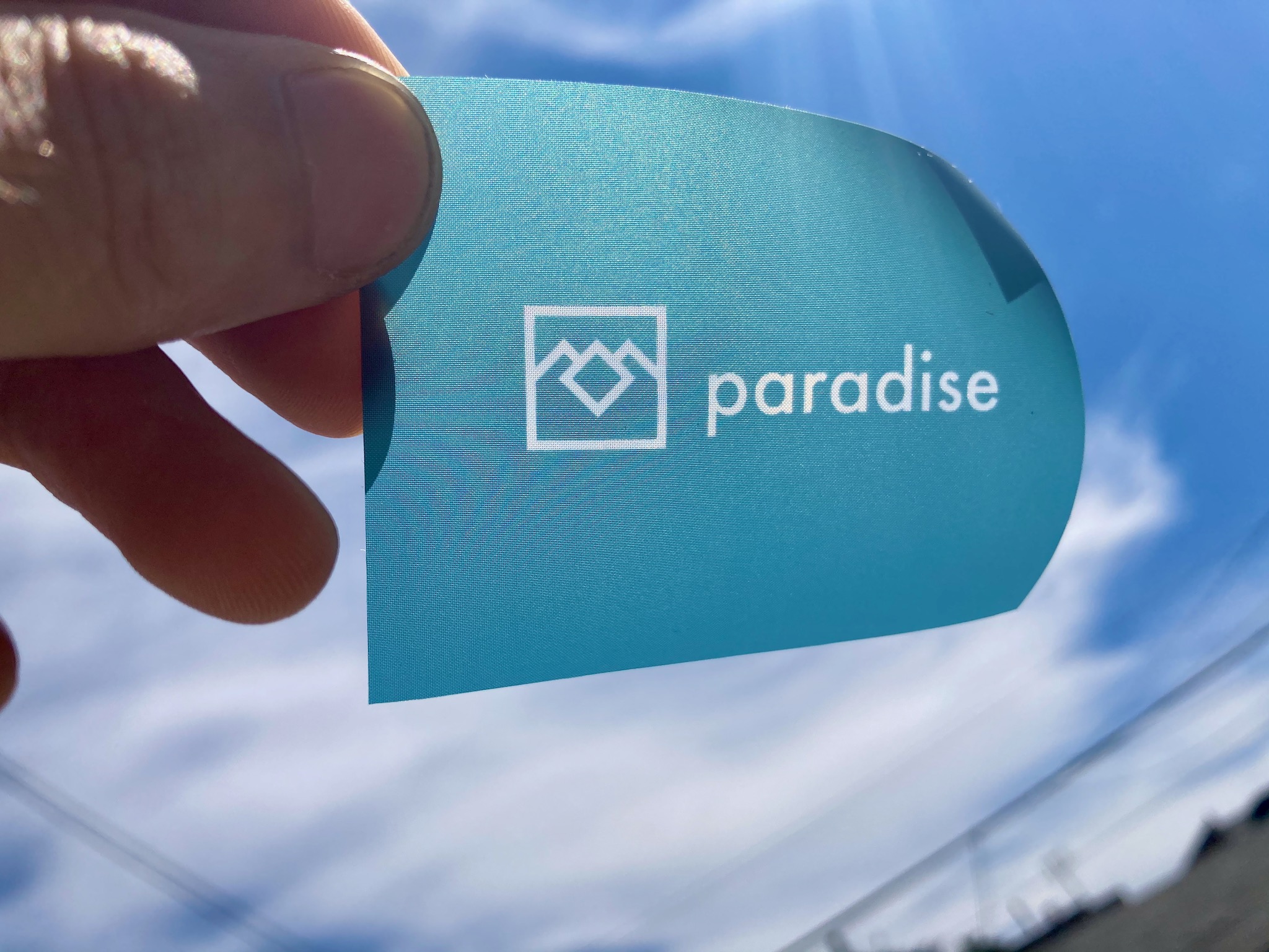
Too bad about the dirty fingernails. But such is life in the fallen world — the plane of existence, incidentally, suggested by the diamond in the Twin Peaks owl logo. I’m sure that in heaven itself, you don’t need a Paradise phono stage at all, and music of perfect fidelity enters your mind directly…
Cutting out the fasciae
While the emulsion was taking its bath, I cut out four fasciae from the Dollarama polypropylene report covers. I measured the fascia of my Snaps at exactly 68 x 199mm and did what I could to replicate those dimensions with an exacto knife, a straight edge, a ruler, some clamps, and a drafting table.
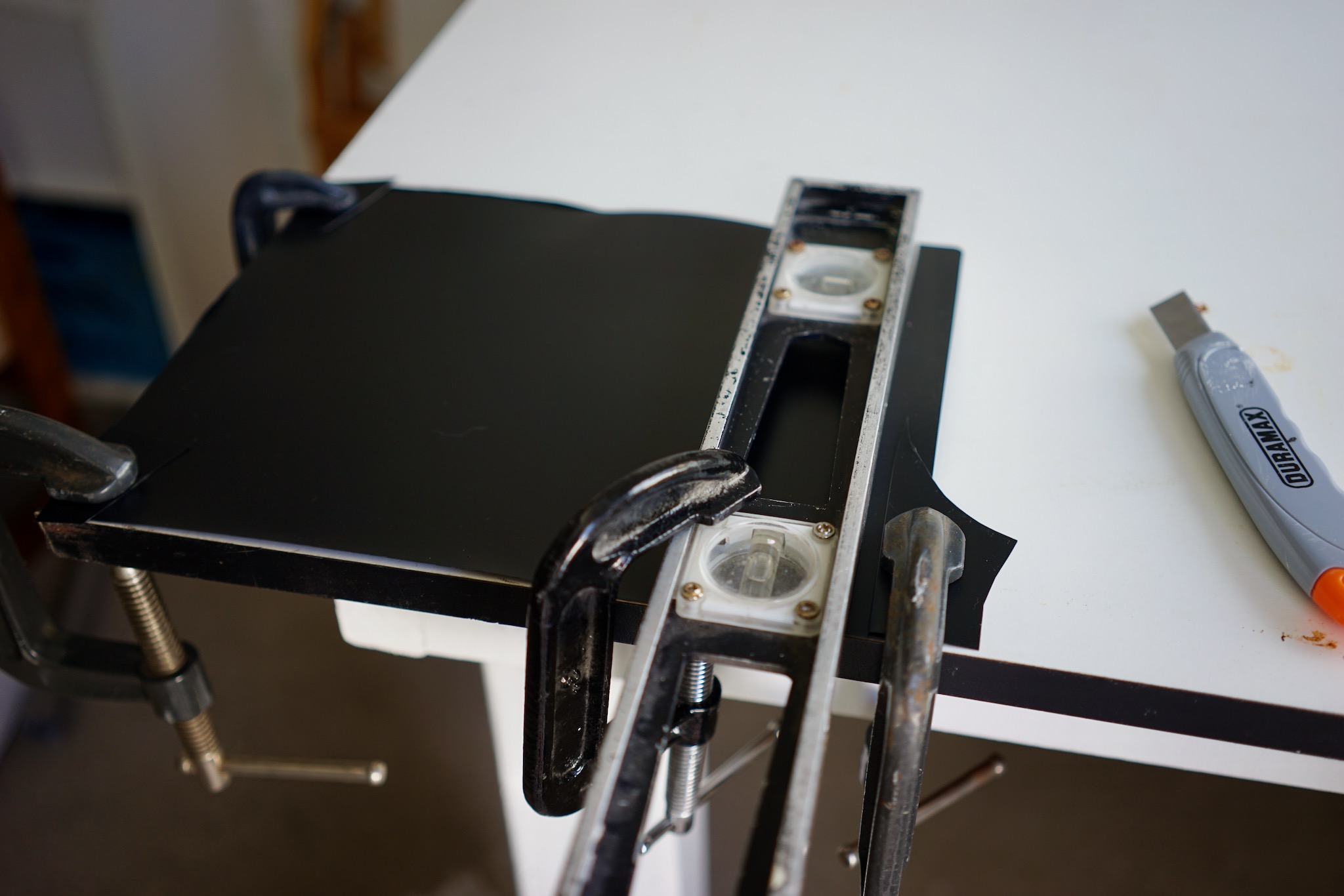
As you’ll see in future photos, their edges aren’t absolutely perfect, but I think they’re good enough given that they’ll be somewhat obscured by their recessed position in the shoebox cases.
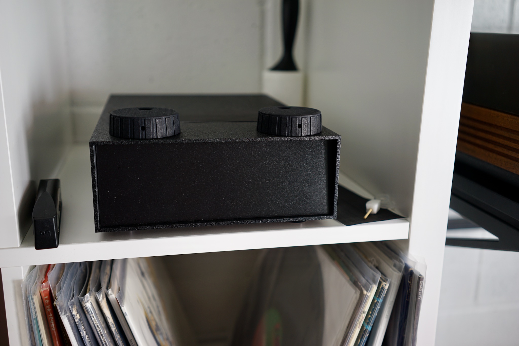
I still need to sand the paint away on my shoebox cases to create the eponymous “Chrome Bumper.” But that polypropylene texture is perfect and beautiful.
Printing the logos
For some reason, I thought making the screen would be the hard part. It wasn’t: it took about an hour. The hard part was printing onto polypropylene.
Two things made it hard: ink selection and technique. Allow me to save you lots of trouble by telling you about the mistakes I made.
I did a lot of googling about which screen printing ink to use, and it seemed that Jacquard Screen Printing Ink was the best, allowing you to print onto plastic and not requiring heat-setting (which fabrics inks require, and which would warp the polypropylene). But I couldn’t find any anywhere: no art stores in Toronto had it, Amazon.ca didn’t have it, and the only online art store in Canada that sold it only had it in huge tubs and charged $20 for shipping.
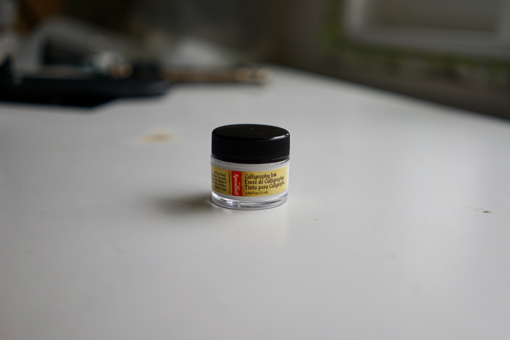
So I went to Midoco, my local art store, and asked for their suggestions. They said that calligraphy ink would stick to plastic and might work with a silkscreen. It cost $2 for a little jar. So I decided to try it.
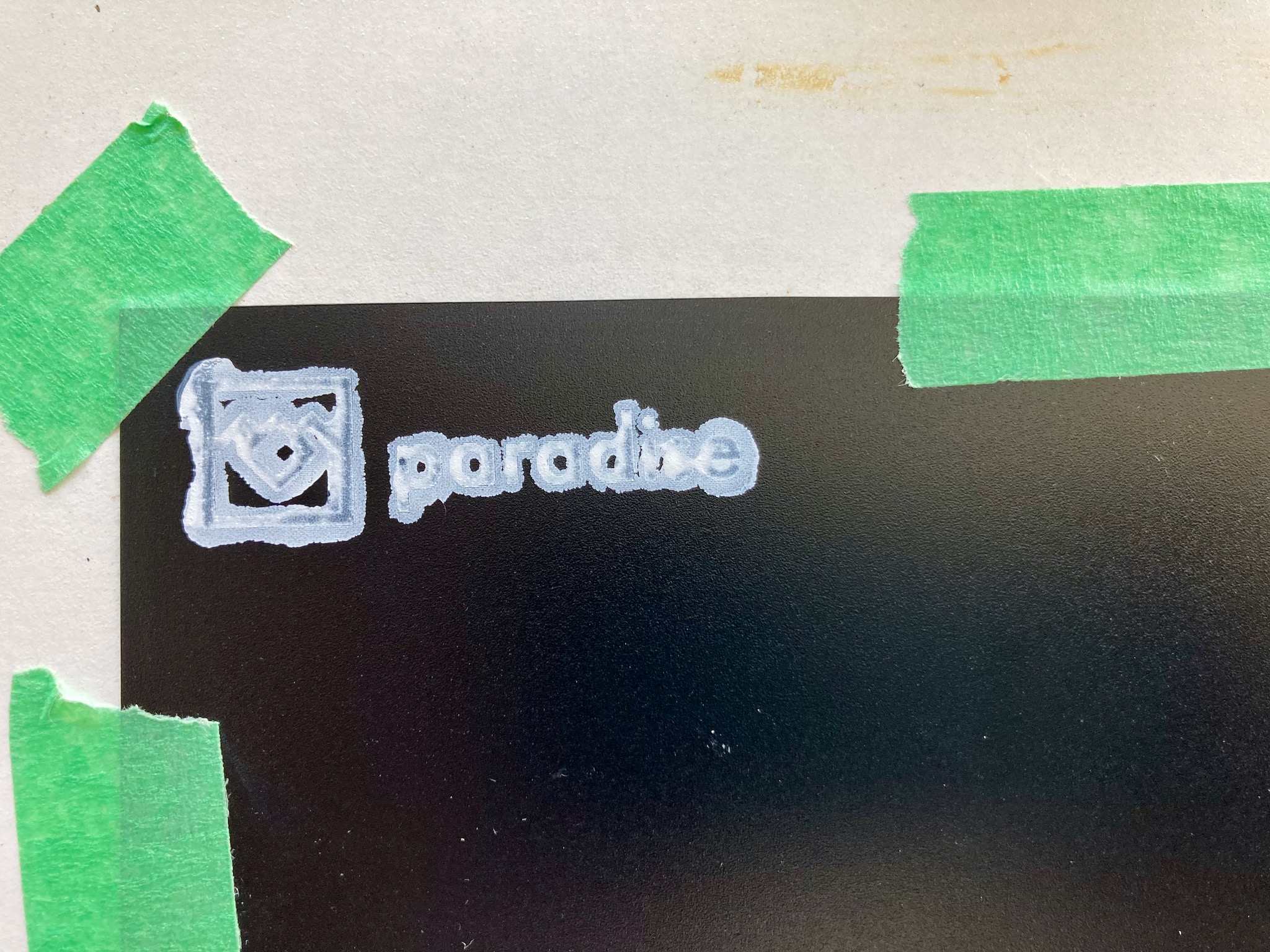
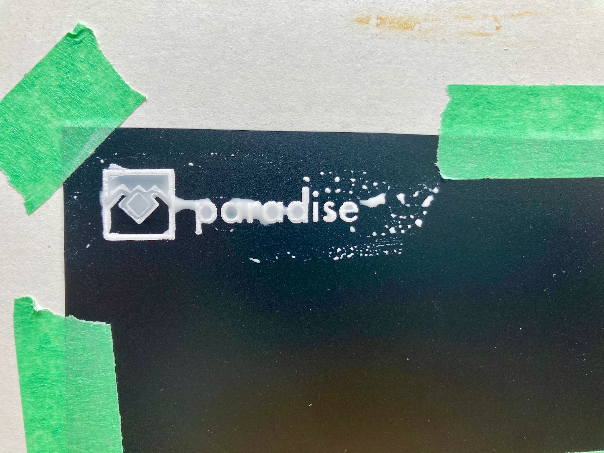
Well, as soon as I got it open, I could see that it was really runny and wasn’t going to work: I remembered the screen printing ink from my long-ago class being really gelatinous. Sure enough, it did not work. You could see the think ink creeping in behind the screen. The best impression I got was this. Not good.
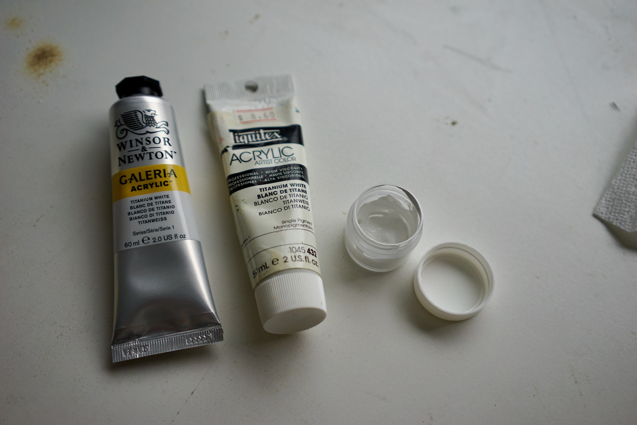
So I went back to Midoco and asked if they had any better suggestions. This time, someone who had actually worked at a printing shop said that regular artist’s acrylic paint should work. I might need to water it down a bit, but it would stick to plastic and would be thick enough. I bought a tube — immediately realizing that Marta probably already had better stuff at home, which it turned out she did. Below is what I used: the student-grade stuff on the left ($8), Marta’s pro-grade stuff in the centre, and a little mixing cup on the right for experiments in watering down.
This stuff worked better, but not well enough. I think the problem was once again that it wasn’t thick enough. Watering it down definitely made things worse. I tried about 10 impressions, growing increasingly frustrated. This was the best I got.
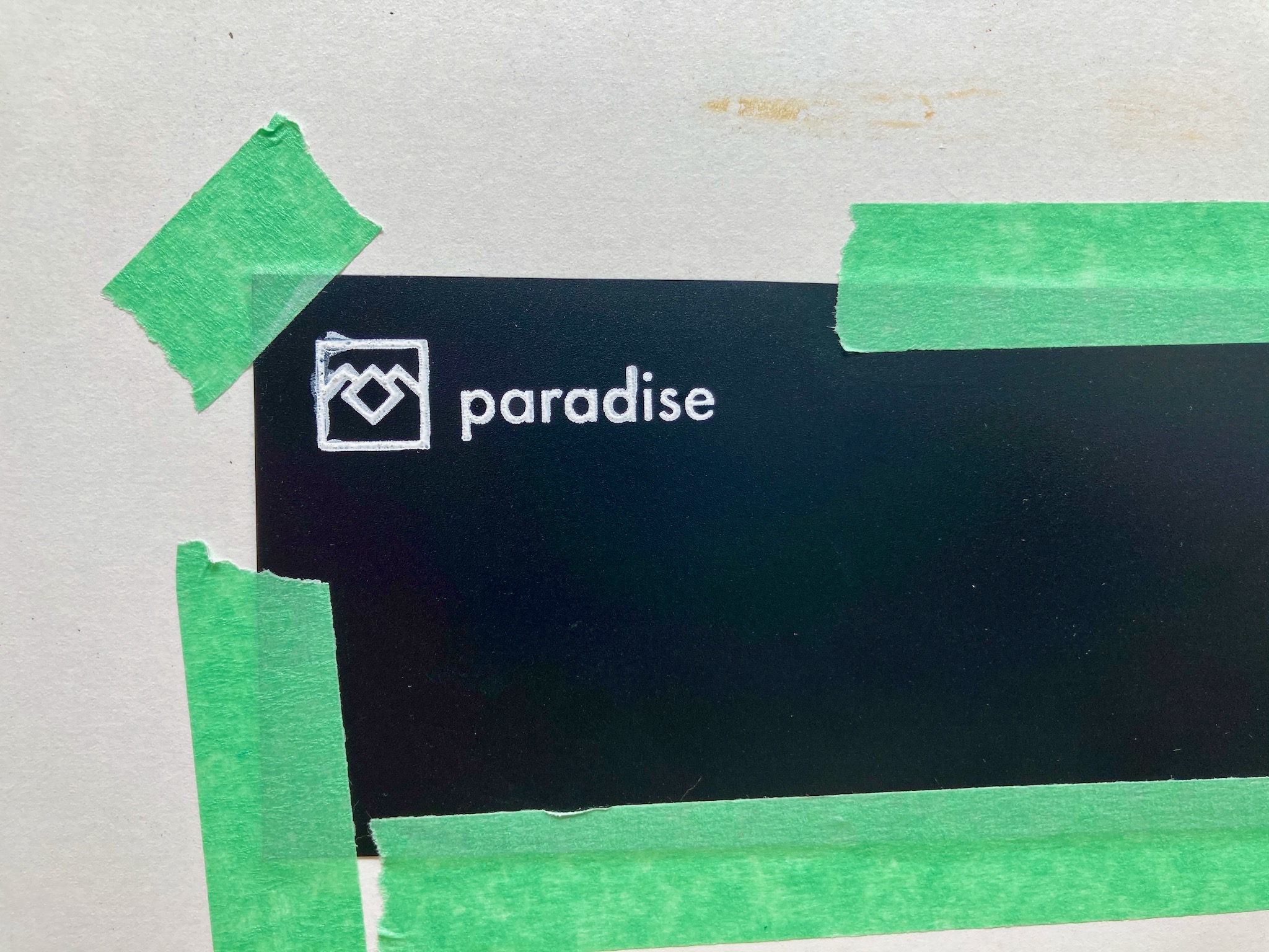
Not good enough! Thankfully I didn’t have to waste any polypropylene on a bad impression: I just washed it right off. (This is a good reminder that polypropylene is surely a tricky surface to print on: totally non-porous, hard, textured…)
It was at this point that Marta asked, “Have you tried Above Ground?” I had not — I had forgotten all about this ridiculously well-stocked art store right next to OCAD. I called them and asked if they had any Jacquard, and they did — including a small tub of opaque white, exactly what I wanted. They closed in 40 minutes and wouldn’t be open again until Tuesday. We jumped in a Lyft and made it there just in time. I came home with this stuff:
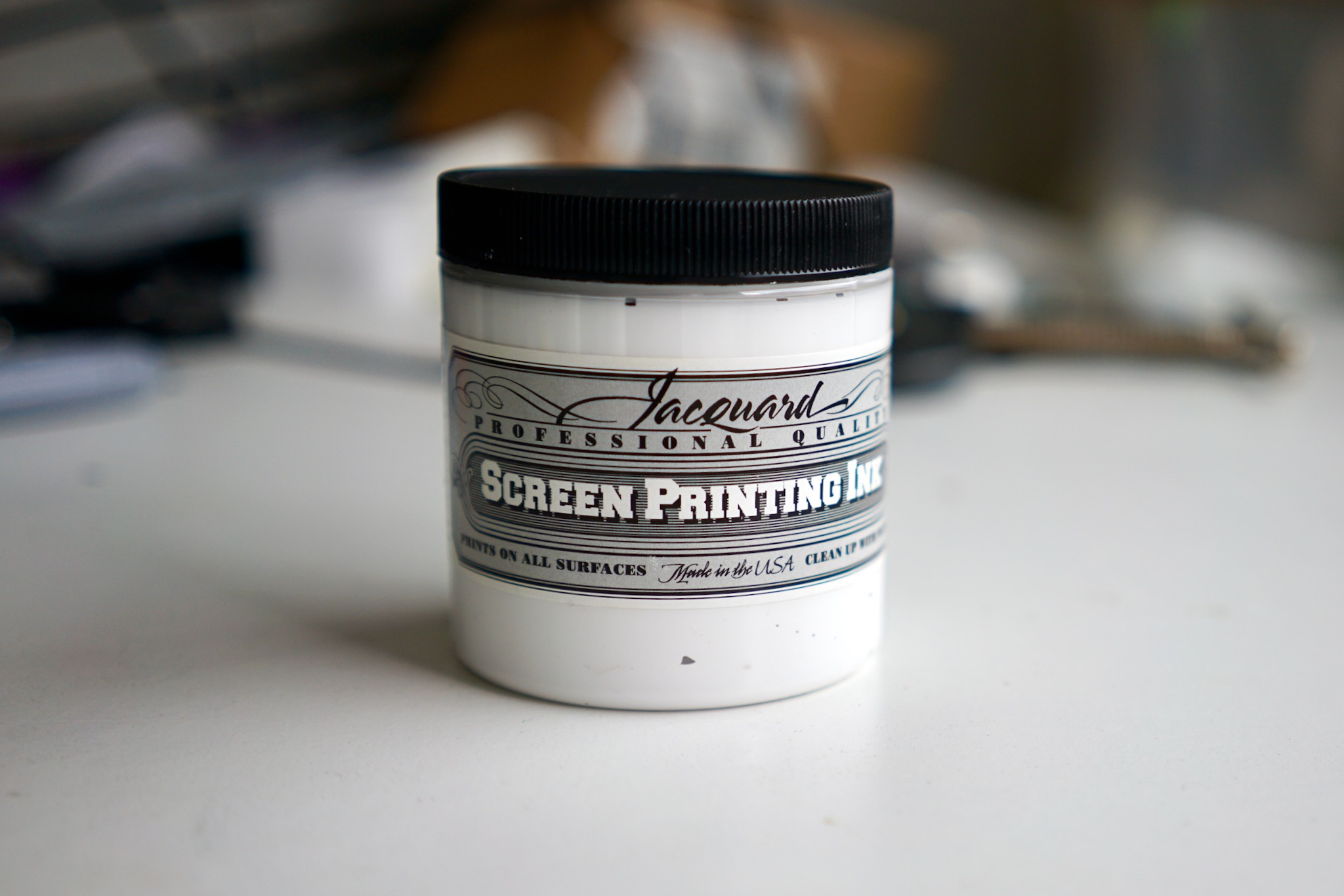
The Jacquard is much thicker than the others: exactly the texture of Nivea face cream (thanks, Simon, for the comparison — spot on!).
The first impression it made (literally and figuratively!) was very good. Too bad I missed a spot. (Marta said she preferred the logo this way!)
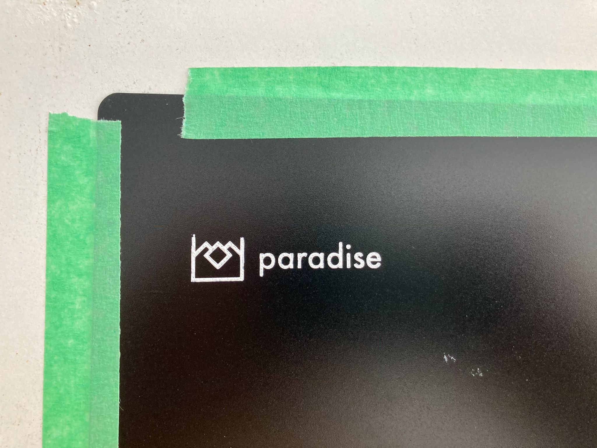
Still, it took a bit of work to refine my technique. Here is a video showing what I eventually settled on:
In words, this is what I did:
- Attach the screen to the surface with a line of painter’s tape along one side only. If you try to attach a tiny screen like this on multiple sides, it will lift off the surface.
- Make a big line of ink just above the design. Make it big and thick.
- Using a squeegee (I used the one that came with my EZ kit), holding it at a 30-45 degree angle, pull the ink over the design away from the taped edge. Then do this again, reusing the ink already gobbed up on your squeegee. (I tried lots of different methods, including applying the ink with a paintbrush, but this double-squeegee method worked best for me.)
- Carefully lift the screen off the surface, holding the surface down with one finger.
Once I’d developed this technique, I got good impressions every time. I had a bunch of “okay” impressions I thought I’d be reasonably happy with if nothing else worked out, but eventually I wiped them all off and got as-good-as-I-could-manage impressions using the above method.
And here’s an overview of the process between impressions — which got really tedious when it seemed like I was never going to get the ink consistency right, but became a pleasure once I’d got my method right.
- Immediately after making the impression, get the screen, squeegee, and paint brush into water right away.
- Rinse the paint off both sides of the screen (I used the “spray” mode on my kitchen sink’s faucet). Be careful on the gummy emulsion side: I avoided using anything other than water on this side, but used a paint brush as necessary to remove stuck paint from the mesh side.
- Put the wet screen a paper towel, mesh side down, and gently blot the gummy emulsion side with another paper towel.
- Very gently blowdry the emulsion side with a hair dryer on a low setting. This saves you a bunch of time: the screen doesn’t work properly if it’s not totally dry, and full drying takes about 15-30 minutes without the blow dryer or direct sunlight (it was after dark when I perfected my method!) But don’t over-do it: the emulsions degrade quickly in high temperatures. I would give it a gentle blow-dry, on a low setting and from a distance, only for about 20 seconds, then let it sit for a few minutes, then dry it again, then let it sit, then give it another quick drying, then do another impression.
The results
They’re not perfect, and they’re not as good as the Naim ones, but I’m totally satisfied with them.
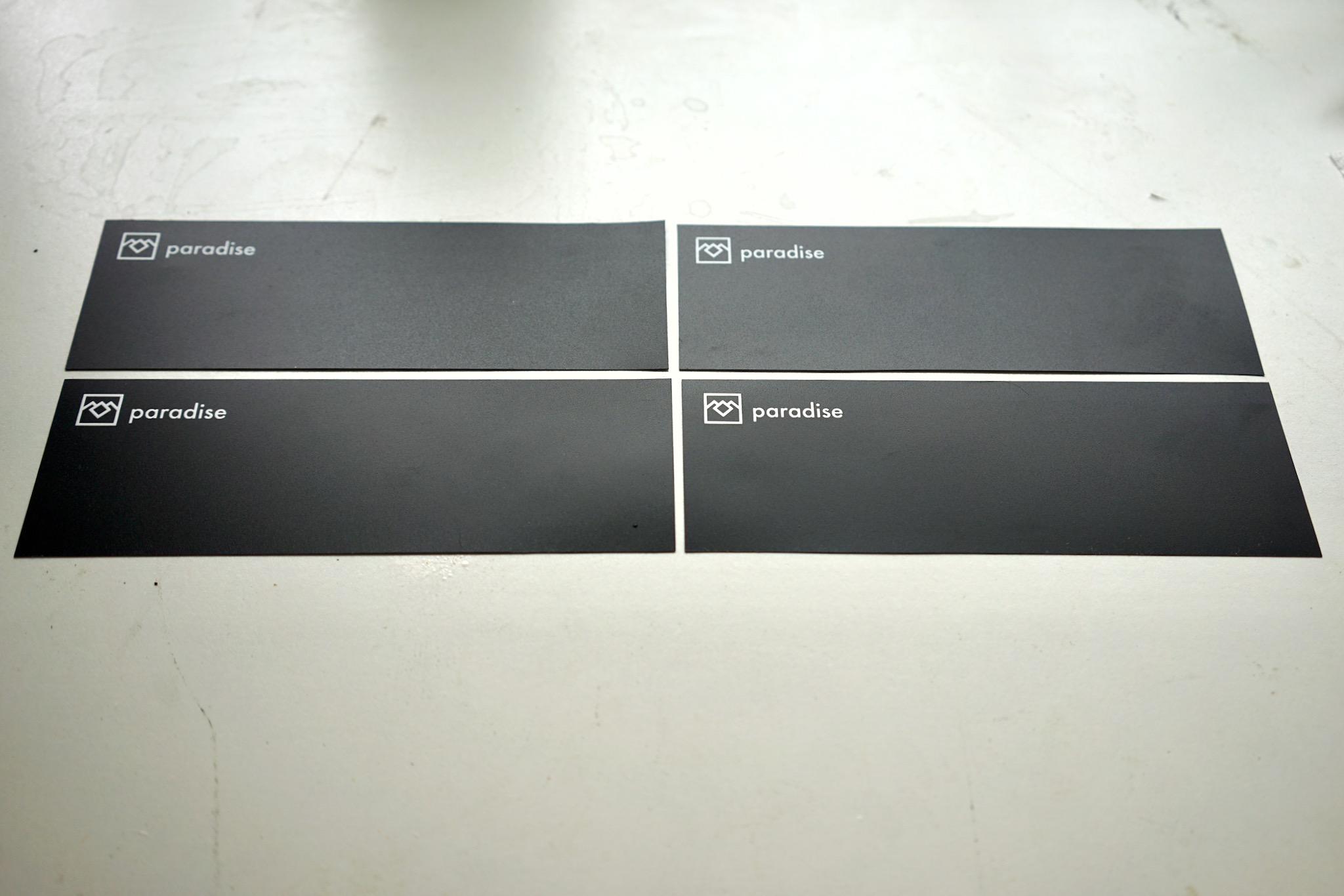
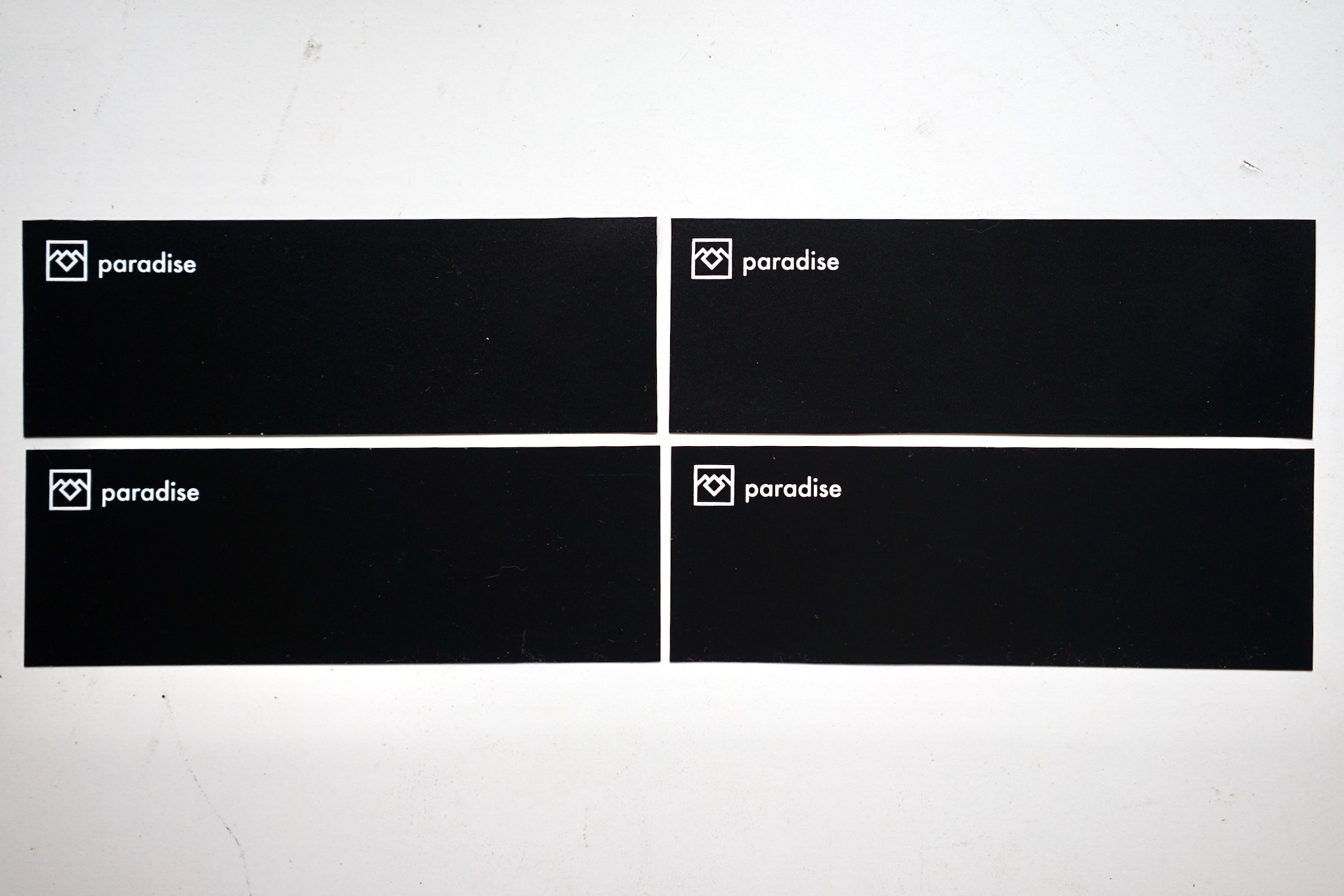
From about a foot away, they look very sharp. Right up close, you can see some “pixellation” around the edges and some unevenness in the surface.
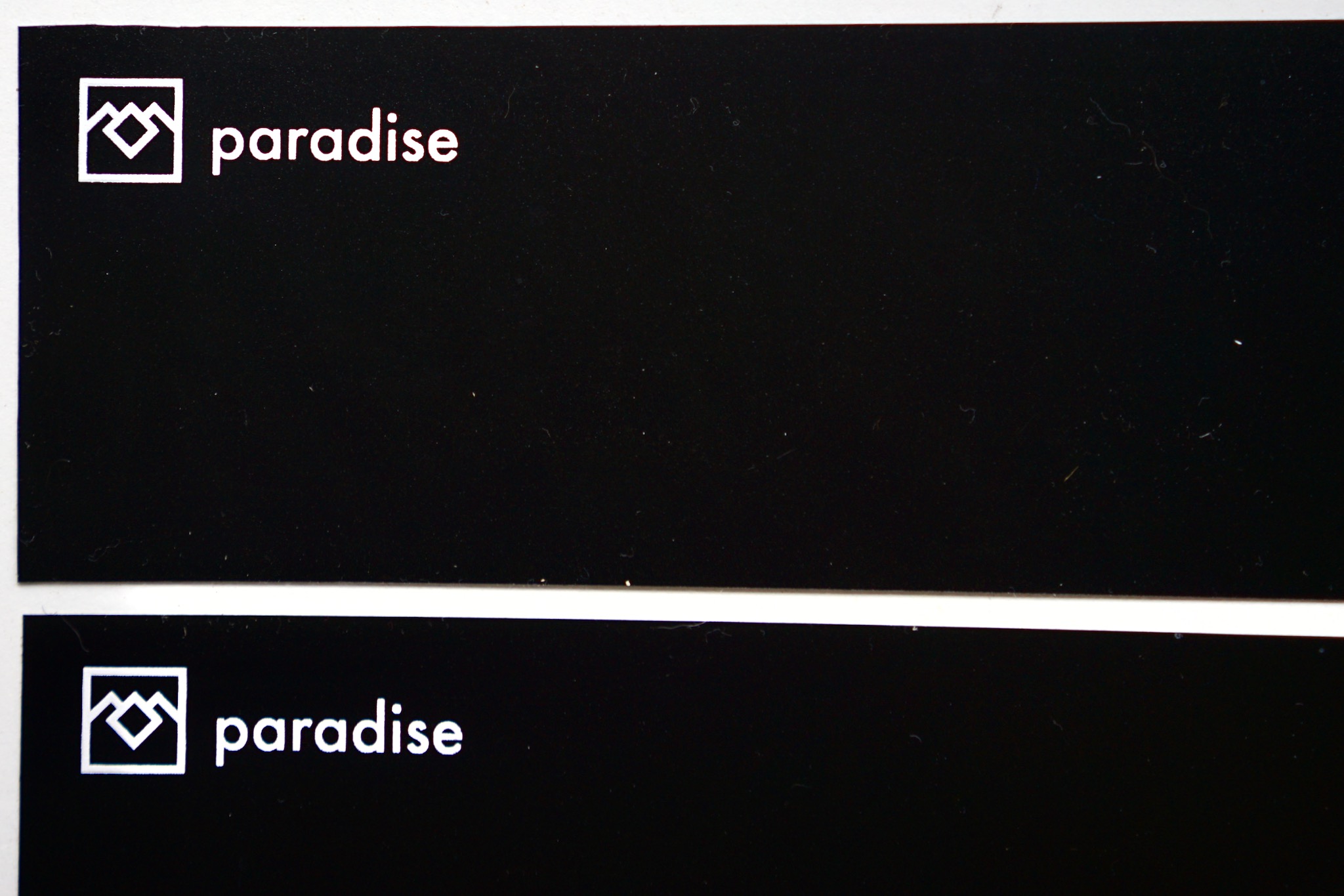
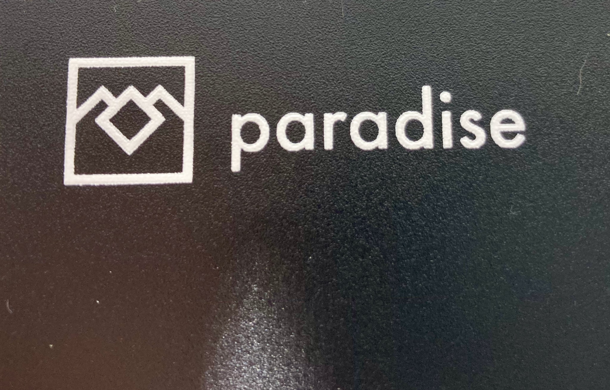
But I think that’s mostly down to the textured surface of the polypropylene, and the inherent limitations of even “high definition” screen mesh. I must say — especially given the frustrations with the calligraphy ink and the artist’s acrylic — that I’m thrilled with the results.
Here’s a sense of how it will look in its case (which still needs its bumper chromed).
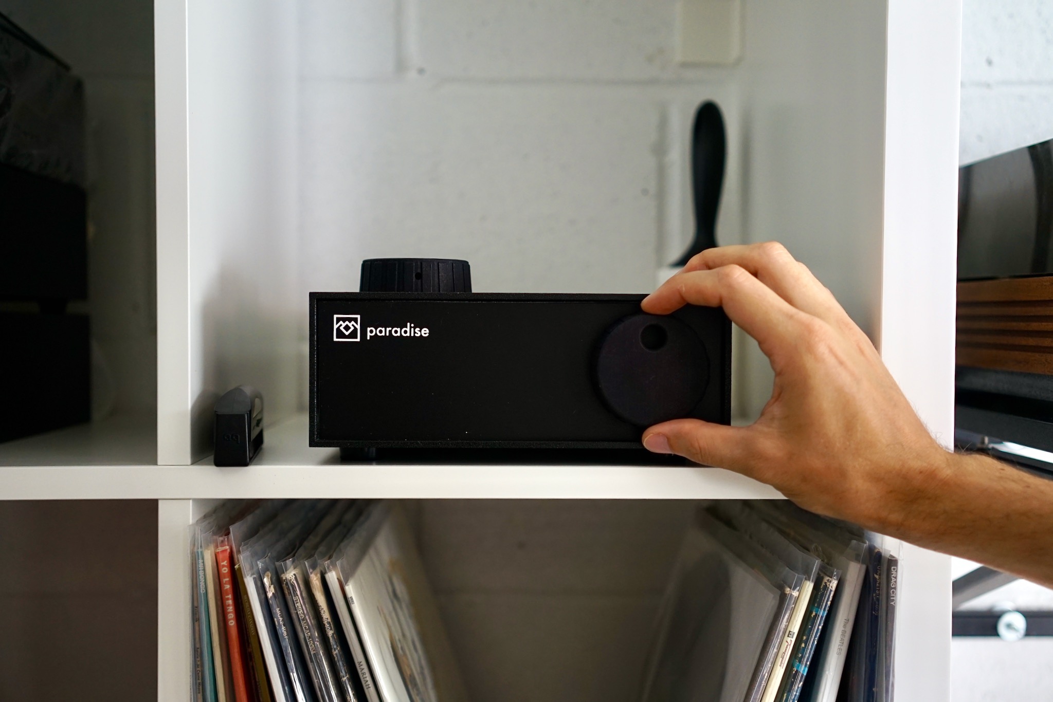
Very cool, I think — and the white is really radiant against the polypropylene.
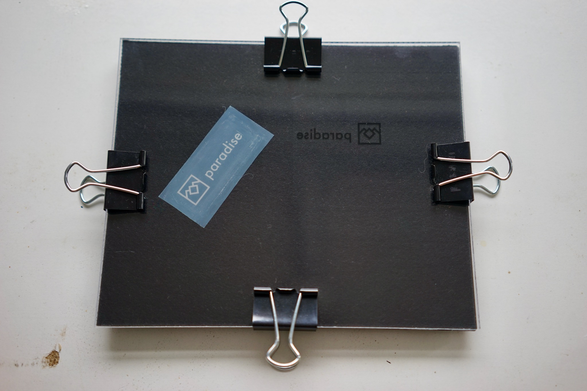
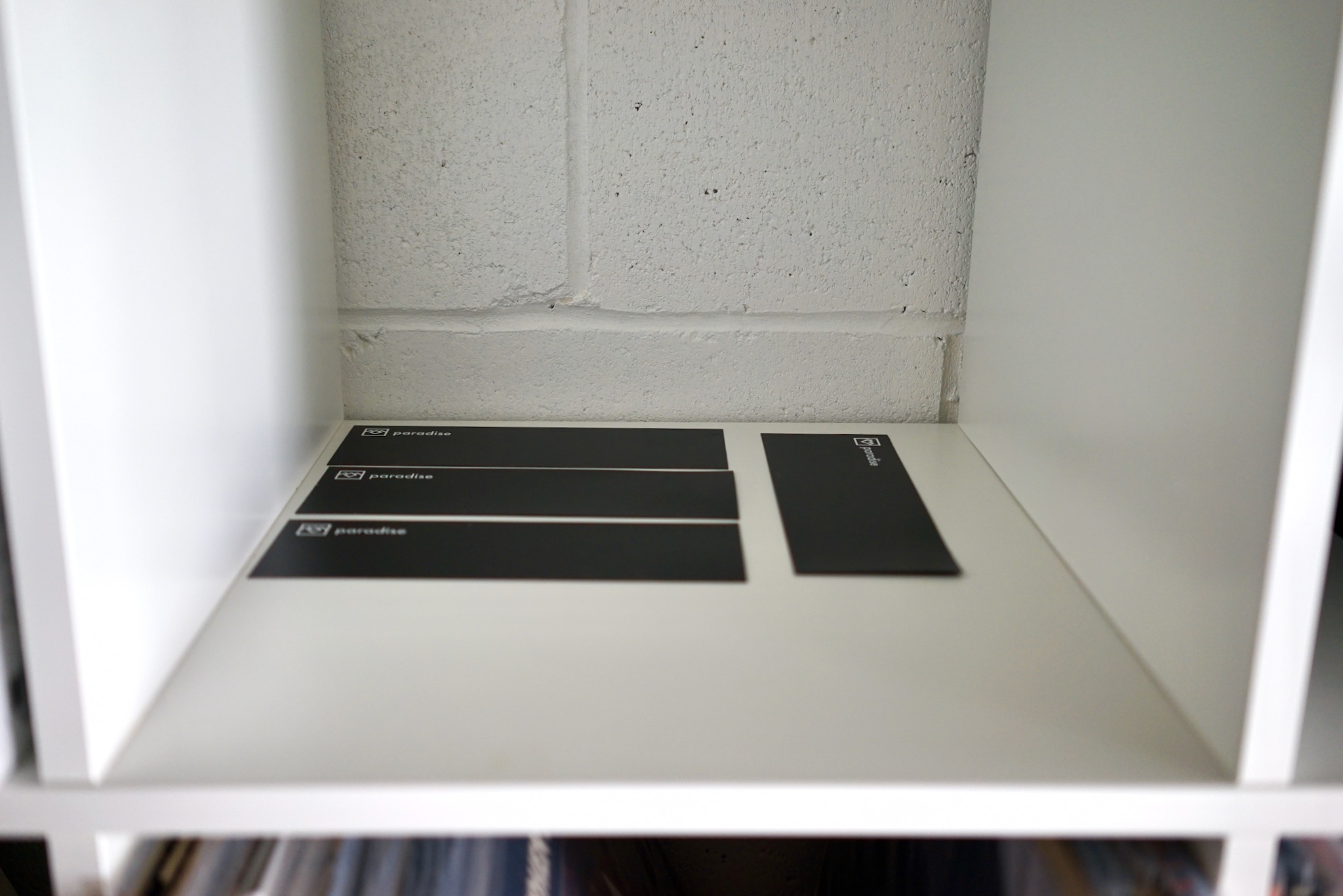
I got pretty nervous taking the above photo, worried the fascia would fall on the floor. This is because it takes an incredible 72 hours for these to cure, and it had only been about 12 when I took that photo. The good news is that one they’re cured, they’re apparently absolutely permanent and extremely hard. Here are the fascia safely curing; only two and a half days to go.
The screen is now back in its exposure board, safely stored in case I ever need to call it back into service…
